
| 일 | 월 | 화 | 수 | 목 | 금 | 토 |
|---|---|---|---|---|---|---|
| 1 | 2 | 3 | ||||
| 4 | 5 | 6 | 7 | 8 | 9 | 10 |
| 11 | 12 | 13 | 14 | 15 | 16 | 17 |
| 18 | 19 | 20 | 21 | 22 | 23 | 24 |
| 25 | 26 | 27 | 28 | 29 | 30 | 31 |
- youtube iframe
- Next.js
- firebaseui
- 타입스크립트
- 파이어베이스로그인
- css
- nvm
- Spread
- nvmrc
- iP
- leetcode977
- Rest
- React
- 커스텀알림
- react-native
- yarn-berry
- 백준
- 파이썬
- react-firebaseui
- 커스텀알락
- 리액트
- 기초
- 자바스크립트
- Python
- 다리놓기
- 구조분해할당
- JS
- 프로토타입
- leetcode189
- mac
- Today
- Total
JadeCode
Next.js에서 나만의 customAlert 만들기 본문
일반 alert창을 조금 특별하게 만들고 싶었다.
너무 너무 만들고 싶었다.
<div onClick = {()=>customAlert("확인")}/>위의 div에서 onClick 을 눌렀을 때 진짜로 커스텀 알람이 실행되길 원했다.
우선 검색을 해 보니 ReactDOM.render를 사용해서 만들어 보길 추천하였다.
그래서 코드를 작성했다.
import { useEffect, useState } from "react";
import ReactDOM from "react-dom";
import styled, { css } from "styled-components";

interface CustomAlertProps {
  message: string;
  onConfirm: () => void;
}

const CustomAlert = ({ message, onConfirm }: CustomAlertProps) => {
//커스텀알락 창
  const [showModal, setShowModal] = useState(false);

  const handleConfirm = () => {
    setShowModal(false);
    setTimeout(() => onConfirm(), 1);
  };

  useEffect(() => {
    setTimeout(() => setShowModal(true), 1);
  }, []);
  return (
    <>
      {/* 아무곳이나 눌러도 알림 창 사라지게 */}
      <AlertModal.Container showModal={showModal} onClick={handleConfirm}>
        <AlertModal.Content>
          <LogoImg src="/Logo.svg" alt="" height="50%" />
          <AlertModal.Message>{message}</AlertModal.Message>
        </AlertModal.Content>
      </AlertModal.Container>
    </>
  );
};

const customAlert = (message: string) => {
//함수 호출
  const handleConfirm = () => {
    const modalRoot = document.getElementById("modal-alert-portal-wrapper");
    if (modalRoot) modalRoot.remove();
  };
  if (typeof window !== "undefined") {
    const subDiv = document.createElement("div");
    subDiv.id = "modal-alert-portal-wrapper";
    document.body.appendChild(subDiv);
    ReactDOM.render(
      <>
        <CustomAlert message={message} onConfirm={handleConfirm} />
      </>,
      subDiv
    );
  }
};

export default customAlert;

const AlertModal = {
  Container: styled.div<{ showModal: boolean }>`
    position: fixed;
    top: -100px;
    left: 0;
    right: 0;
    bottom: 0;
    display: flex;
    flex-direction: column;
    align-items: center;
    opacity: 0;
    pointer-events: none;
    transition: all 0.1s ease-in-out;
    cursor: default;

    ${({ showModal }) =>
      showModal &&
      css`
        top: 0;
        opacity: 1;
        pointer-events: auto;
      `}
  `,

  Content: styled.div`
    margin-top: 20px;
    background-color: white;
    border-radius: 8px;
    padding: 10px;
    box-shadow: 0 2px 6px rgba(0, 0, 0, 0.2);
    display: flex;
    flex-direction: column;
    align-items: center;
    justify-content: space-between;
    max-width: 400px;
    width: 100%;
    height: 7rem;
    position: relative;
  `,

  Message: styled.div`
    font-size: 1.2rem;
  `,
};

const LogoImg = styled.img`
  width: 15vw;
  object-fit: contain;
`;
위의 코드는 DOM으로 직접 접근해서
subDiv.id = "modal-alert-portal-wrapper"라는 div Element를 document.body에 추가하고,
ReactDOM.render(<></>,subDiv)를 사용하여 portal을 만들었다.
하지만

Warning: ReactDOM.render is no longer supported in React 18. Use createRoot instead. Until you switch to the new API, your app will behave as if it's running React 17. Learn more: https://reactjs.org/link/switch-to-createroot
How to Upgrade to React 18 – React
The library for web and native user interfaces
react.dev
이런 오류가 나타나면서 새로운 createroot라는 것을 추천해줬다.
현재 React18 버전을 사용하고 있기 때문에 ReactDOM.render는 추천하지 않는다는 오류였다.
이 오류를 해결하기 위해
createPortal함수도 써보고 다 해봤지만 며칠을 해결하지 못했다.
하지만 공식문서를 잘 읽어보니 해결책이 있었다.
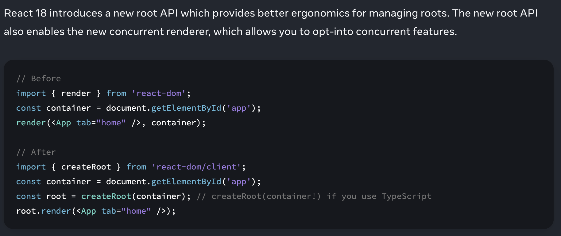
createRoot를 사용해서 써 보는 방법이다!!
그래서 나도 바꿨다.
//Before
ReactDOM.render(
    <>
    	<CustomAlert message={message} onConfirm={handleConfirm} />
    </>,
    subDiv
);

//After
const root = createRoot(subDiv);
root.render(<CustomAlert message={message} onConfirm={handleConfirm} />);
동작은 똑같이 되지만 Warning이 사라져서 매우 기분이 좋다.

// 전체코드

import { useEffect, useState } from "react";
import styled, { css } from "styled-components";
import { createRoot } from "react-dom/client";
interface CustomAlertProps {
  message: string;
  onConfirm: () => void;
}

const CustomAlert = ({ message, onConfirm }: CustomAlertProps) => {
  const [showModal, setShowModal] = useState(false);

  const handleConfirm = () => {
    setShowModal(false);
    setTimeout(() => onConfirm(), 1);
  };

  useEffect(() => {
    setTimeout(() => setShowModal(true), 1);
  }, []);
  return (
    <>
      {/* 아무곳이나 눌러도 알림 창 사라지게 */}
      <AlertModal.Container showModal={showModal} onClick={handleConfirm}>
        <AlertModal.Content>
          <LogoImg src="/Logo.svg" alt="" height="50%" />
          <AlertModal.Message>{message}</AlertModal.Message>
        </AlertModal.Content>
      </AlertModal.Container>
    </>
  );
};

const customAlert = (message: string) => {
  const handleConfirm = () => {
    const modalRoot = document.getElementById("modal-alert-portal-wrapper");
    if (modalRoot) modalRoot.remove();
  };
  if (typeof window !== "undefined") {
    const subDiv = document.createElement("div");
    subDiv.id = "modal-alert-portal-wrapper";
    document.body.appendChild(subDiv);

    const root = createRoot(subDiv);
    root.render(<CustomAlert message={message} onConfirm={handleConfirm} />);
    }
};

export default customAlert;

const AlertModal = {
  Container: styled.div<{ showModal: boolean }>`
    position: fixed;
    top: -100px;
    left: 0;
    right: 0;
    bottom: 0;
    display: flex;
    flex-direction: column;
    align-items: center;
    opacity: 0;
    pointer-events: none;
    transition: all 0.1s ease-in-out;
    cursor: default;

    ${({ showModal }) =>
      showModal &&
      css`
        top: 0;
        opacity: 1;
        pointer-events: auto;
      `}
  `,

  Content: styled.div`
    margin-top: 20px;
    background-color: white;
    border-radius: 8px;
    padding: 10px;
    box-shadow: 0 2px 6px rgba(0, 0, 0, 0.2);
    display: flex;
    flex-direction: column;
    align-items: center;
    justify-content: space-between;
    max-width: 400px;
    width: 100%;
    height: 7rem;
    position: relative;
  `,

  Message: styled.div`
    font-size: 1.2rem;
  `,
};

const LogoImg = styled.img`
  width: 15vw;
  object-fit: contain;
`;
며칠동안 잡고있었던 오류를 해결해서 매우 뿌듯하다
'개발 > 프로젝트' 카테고리의 다른 글
| [Next.js13] 2023. 새로운 next (0) | 2023.05.21 |
|---|---|
| 웹사이트를 앱으로? 웹뷰! (0) | 2023.05.18 |
| 데러쿱 (0) | 2021.11.19 |
| 데러쿱 (0) | 2021.11.18 |
| DAERKOOB (0) | 2021.10.28 |
